Preparing tables and figures for journal submission is not simply a matter of making data look attractive. A manuscript can contain statistically sound research and still encounter editorial queries because its tables are difficult to interpret, figures lose resolution when reduced, legends are incomplete, or visualizations duplicate information already presented in the text.
Tables and figures are part of the evidence architecture of a research paper. They must be accurate, reproducible, readable, appropriately cited, and compliant with the target journal’s production requirements.
For authors preparing work for high-impact journals, the central rule is straightforward: design every display item for scientific communication first and visual polish second. The International Committee of Medical Journal Editors (ICMJE) recommends concise, self-explanatory tables, sequential numbering, informative titles, clear column headings, appropriate statistical descriptors, and figures that remain legible when reduced for publication.
This guide explains how to prepare tables and figures for journal submission, including formatting data tables for academic publishing, high-impact journal figure resolution requirements, scientific illustration and chart best practices, peer review standards for data visualization, and methods for avoiding common graphic errors in manuscripts.
💡 Need expert help with your paper?
Transform your manuscript with ManuscriptLab’s professional editing & formatting services!
1. Start With the Target Journal’s Author Guidelines
The first mistake authors make is designing tables and figures before checking the journal’s specifications.
There is no universal table or figure format that satisfies every publisher. ICMJE explicitly advises authors to prepare tables according to the specific journal’s requirements, while Nature provides its own detailed specifications for figure dimensions, typefaces, file formats, resolution, and color.
What to check
Before creating or revising any display item, record:
- Maximum number of tables and figures
- Whether tables must remain editable
- Whether figures should be embedded in the manuscript or uploaded separately
- Preferred file formats
- Required resolution
- RGB or CMYK color requirements
- Maximum figure dimensions
- Font and minimum text-size requirements
- Caption or legend format
- Supplementary or Extended Data policies
- Color-figure charges, if applicable
- Rules for previously published material
Why this matters: a technically excellent figure can still require reworking if it does not meet production specifications.
Industry-standard metric: maintain a journal-specific submission checklist rather than relying on a generic “publication-ready” setting. For example, Nature’s production guidelines specify standard figure widths of approximately 89 mm for a single column and 183 mm for a double column, while its final-production guidance specifies 300–600 dpi for photographic images.
Common pitfall: assuming that the journal’s initial-submission requirements are identical to its post-acceptance production requirements. They may not be. Nature, for example, states that high-resolution production figures are requested after acceptance rather than necessarily at initial submission.
2. Decide Whether the Data Belongs in a Table or Figure
Do not create a table or graph merely because the dataset contains numbers.
Use a table when readers need exact values, detailed comparisons, subgroup information, or methodological information. Use a figure when the primary objective is to communicate a pattern, relationship, distribution, trend, or visual comparison.
ICMJE specifically advises authors to use graphs as an alternative to tables containing many entries and warns against duplicating the same data in both graphs and tables.
| Display format | Best used for | Key strength | Common problem |
| Data table | Exact numerical values | Precision | Excessive density |
| Bar chart | Category comparisons | Simple comparison | Truncated axes or excessive decoration |
| Line graph | Trends over ordered intervals | Shows change | Connecting inappropriate data points |
| Scatter plot | Associations between continuous variables | Shows distribution and relationship | Overplotting |
| Box plot | Distribution and group comparison | Displays spread and outliers | Poorly explained statistics |
| Kaplan–Meier plot | Time-to-event outcomes | Survival comparison | Missing censoring information |
| Forest plot | Effect estimates and confidence intervals | Compact evidence synthesis | Unclear reference line |
| Flowchart | Study or participant workflow | Process transparency | Overloaded text |
| Microscopy/clinical image | Morphological or diagnostic evidence | Direct visual evidence | Insufficient resolution or scale |
The duplication test
Ask one question:
Does this display item tell the reader something that cannot be communicated more efficiently elsewhere?
If a table contains 20 numbers and the scientific point is simply that one group consistently increased over time, a line graph may communicate the result more effectively. Conversely, if readers need the exact values behind a clinical outcome, a table may be necessary.
The objective is not to maximize the number of visuals. It is to maximize information density without sacrificing interpretability.
Also read: 10 Key Reasons Manuscripts Get Rejected Before Peer Review
3. Apply APA/CSE Table Design Principles Without Over-Formatting
When considering APA/CSE table design guidelines for research papers, remember that style manuals provide conventions, but the target journal’s instructions take precedence.
The Council of Science Editors (CSE) describes its style manual as an authoritative reference for scientific authors, editors, publishers, and students, including guidance covering numbers, units, statistics, tables, and figures.
Build tables for rapid scanning
A publication-quality table should generally contain:
- A sequential table number
- A concise, informative title
- Clearly defined column headings
- Consistent units
- Appropriate decimal precision
- Explanatory footnotes
- Definitions for nonstandard abbreviations
- Statistical notation where applicable
- A source or permissions statement when required
ICMJE recommends that table titles be short but sufficiently self-explanatory, with explanatory information placed in footnotes rather than overloaded headings. It also recommends identifying statistical measures of variation such as standard deviation and standard error of the mean.
Avoid decorative table design
Academic tables rarely benefit from:
- Three-dimensional effects
- Excessive shading
- Multiple font families
- Decorative icons
- Unnecessary vertical rules
- Dense color coding
- Inconsistent alignment
Instead, prioritize hierarchy.
For example:
Table 1. Baseline characteristics of study participants
| Variable | Intervention (n = 120) | Control (n = 118) | P value |
| Age, years, mean ± SD | 54.2 ± 8.1 | 53.7 ± 8.4 | 0.64 |
| Female sex, n (%) | 63 (52.5) | 60 (50.8) | 0.80 |
| BMI, kg/m², mean ± SD | 27.4 ± 4.3 | 27.1 ± 4.5 | 0.61 |
Note: BMI, body mass index; SD, standard deviation.
The exact formatting will vary by journal, but the underlying principle remains constant: the reader should understand the table without searching through the main text for definitions.
4. Standardize Numbers, Units, and Statistical Notation
A table can be visually perfect and scientifically confusing if its numerical conventions are inconsistent.
Align:
- Decimal places
- Thousands separators
- Units
- Percentages
- Confidence intervals
- P values
- Statistical symbols
- Significant figures
For example, do not report one measurement as 4.2, another as 4.237, and another as 4.24 unless the differences in precision are scientifically justified.
ICMJE recommends reporting measurements using metric units or their decimal multiples and advises authors to consult individual journals regarding laboratory and clinical units.
Also read: How to Respond to Reviewer Comments (With Template and Examples)
Report uncertainty, not only significance
Where appropriate, tables should communicate effect size and precision rather than relying exclusively on P values. ICMJE specifically advises authors to quantify findings with appropriate indicators of measurement error or uncertainty, such as confidence intervals.
Common pitfall: presenting P < 0.05 as the principal evidence while omitting the magnitude of the effect and its uncertainty.
A stronger presentation might include:
Adjusted odds ratio = 1.84 (95% CI, 1.21–2.79; P = 0.004)
This gives the reader information about direction, magnitude, precision, and statistical evidence.
5. Prepare Figures at Publication-Quality Resolution
One of the most common technical problems in manuscript production is submitting a figure that looks sharp on a laptop but becomes pixelated when enlarged or printed.
Understand raster versus vector graphics
Raster images are composed of pixels. Photographs, microscopy images, radiology scans, and many screenshots fall into this category.
Vector graphics are mathematically defined shapes and lines. Graphs, diagrams, flowcharts, and line illustrations should generally be supplied as vector artwork whenever the journal permits it.
Nature’s final-submission guidance recommends editable vector formats such as AI, EPS, or PDF for line drawings and graphs, while photographic images can be supplied as high-resolution TIFF or PSD files. Nature specifies 300–600 dpi for photographic images and states that artificially increasing an image’s resolution does not improve its quality.
Practical resolution guide
| Figure type | Recommended working standard | Preferred approach |
| Photographic/clinical image | ≥300 dpi | TIFF/PSD where accepted |
| High-detail photographic material | 300–600 dpi | TIFF/PSD |
| Line art | Vector preferred | PDF/EPS/AI |
| Graphs/charts | Vector preferred | PDF/EPS/SVG if accepted |
| Initial peer-review submission | Journal-specific | Ensure readable at review size |
| Final production file | Journal-specific | Follow publisher’s exact specification |
These are working standards, not universal submission rules. Always verify the target journal’s current instructions.
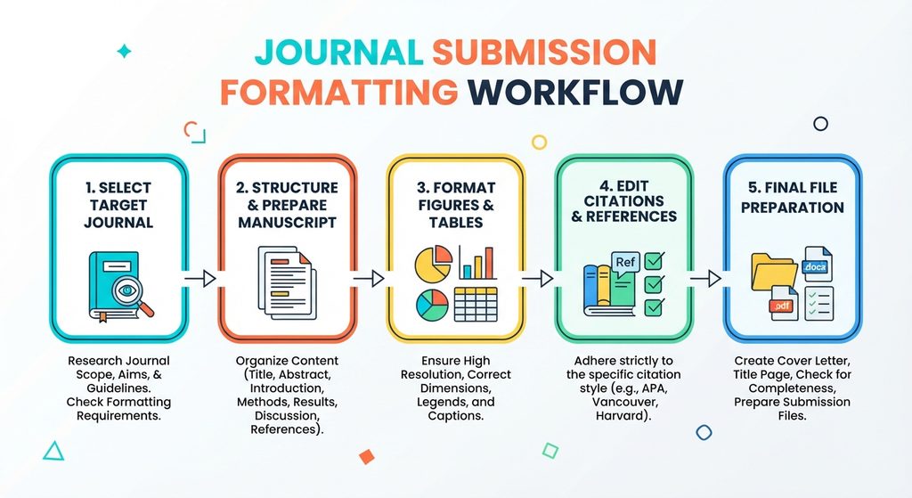
6. Design Charts for Peer Review, Not Presentation Slides
A figure intended for a conference presentation is not automatically suitable for a journal article.
Journal figures are often reduced to fit one- or two-column layouts. Therefore, test your figure at its anticipated final physical size, not only at 100% zoom on your monitor.
Nature explicitly advises authors to check that lettering remains readable when figures are reduced and specifies a minimum line weight for its production artwork.
Follow these scientific illustration and chart best practices
Use a meaningful axis. Label the variable, unit, and relevant scale.
Avoid misleading axes. A truncated y-axis can exaggerate apparent differences when a zero baseline is expected or scientifically meaningful.
Use uncertainty indicators. Error bars should be defined in the legend. State whether they represent SD, SEM, confidence intervals, or another quantity.
Reduce unnecessary visual elements. Remove decorative backgrounds, gradients, excessive gridlines, and three-dimensional effects.
Make categories distinguishable without color alone. Use line patterns, symbols, labels, or shapes where appropriate.
Check accessibility. Nature recommends avoiding red-versus-green contrast and encourages color-safe palettes.
A figure should survive grayscale
Convert a draft figure temporarily to grayscale.
If two groups become indistinguishable, the visualization relies too heavily on color. That can create problems for readers with color-vision deficiencies and for print reproduction.
7. Write Legends That Make Figures Self-Explanatory
A figure should not require the reader to reconstruct its meaning from several paragraphs of the Results section.
A strong legend identifies:
- What was measured
- The study population or experimental material
- Groups or conditions
- Statistical methods where necessary
- Error-bar definitions
- Abbreviations
- Symbols
- Scale bars
- Panel descriptions
- Relevant sample sizes
ICMJE recommends that figures be as self-explanatory as possible and that titles and detailed explanations appear in legends rather than being crowded onto the illustration. It also requires clear explanations for symbols, arrows, letters, and numbers used to identify parts of an image.
For microscopy, include an internal scale marker and explain the scale and staining method where applicable.
Example structure
Figure 2. Association between treatment exposure and biomarker concentration.
Scatter plot showing biomarker concentration according to treatment exposure in the study population (n = 246). The solid line represents the fitted regression model, and the shaded region represents the 95% confidence interval. BMI, body mass index.
The exact wording should reflect the analysis actually performed.
Also read: How to Publish a Research Paper in a Journal
8. Avoid Common Graphic Errors in Manuscripts
The phrase avoiding common graphic errors in manuscripts covers more than blurry images.
Perform a technical and scientific audit for:
Data mismatch
Check every plotted value against the underlying dataset.
A figure generated from an outdated spreadsheet can create discrepancies between the Results section, tables, supplementary files, and plotted results.
Incorrect error bars
Never label an error bar as “± error” without defining what it represents.
SD, SEM, 95% CI, interquartile range, and other measures communicate different information.
Inconsistent sample sizes
If a figure reports n = 250, confirm that the underlying analysis actually includes 250 observations. Explain exclusions or missing observations when relevant.
Hidden image manipulation
Do not selectively enhance, remove, duplicate, or rearrange image content in a way that changes or obscures the evidence.
COPE provides specific guidance for concerns involving inappropriate image manipulation, including duplication or selective editing that could affect conclusions.
Over-compressed images
Repeated JPEG compression can introduce artifacts that interfere with interpretation, particularly in microscopy, electrophoresis, radiology, and other image-dependent research.
Inconsistent typography
Use a consistent typeface, capitalization system, unit style, and symbol convention across figures.
For example, if Figure 1 labels a variable as Age (years) and Figure 3 uses Age, years, establish whether the difference is intentional or simply an editing inconsistency.
9. Check Copyright, Permissions, and Data Provenance
A figure does not become your intellectual property merely because you redraw it.
If you reuse or adapt a previously published figure, image, diagram, or table, determine whether permission is required and provide appropriate attribution.
ICMJE states that previously published figures require acknowledgment of the original source and written permission from the copyright holder when applicable.
Nature similarly notes that it discourages reuse or adaptation of previously published display items and may require alternative material when rights cannot be obtained.
Maintain a provenance record containing:
- Original source
- Dataset or experiment
- Software used
- Analysis version
- Date generated
- Author responsible for preparation
- Permissions documentation
- Final submitted filename
This creates an audit trail if an editor asks how a display item was produced.
10. Run a Final Pre-Submission Figure and Table Audit
Before submission, inspect every display item twice: scientifically and technically.
Scientific audit
Ask:
- Does every number match the source dataset?
- Are all groups represented?
- Are denominators correct?
- Are statistical tests appropriate?
- Are uncertainty measures defined?
- Are axes accurate?
- Are units correct?
- Does the visualization support the stated conclusion?
- Is any data duplicated unnecessarily?
Production audit
Check:
- Figure and table numbering
- Order of first citation
- Cross-references in the manuscript
- Legend completeness
- Resolution
- Dimensions
- File format
- Color space
- Font consistency
- Minimum readable text
- Scale bars
- Abbreviation definitions
- Copyright permissions
- Supplementary/Extended Data labeling
ICMJE recommends numbering tables and figures consecutively according to their first citation and ensuring every table is cited in the text.
For medical research, also verify that display items align with the applicable reporting guideline, such as CONSORT for randomized trials, STROBE for observational studies, PRISMA for systematic reviews, or STARD for diagnostic-accuracy studies.
Also read: Professional Manuscript Editing and Formatting Services
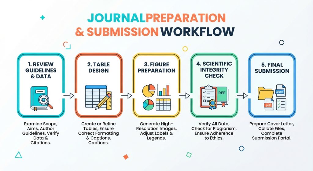
A Practical 10-Step Workflow for Journal-Ready Display Items
Use this sequence before uploading your manuscript:
Step 1 — Select the target journal.
Download its current author and artwork guidelines.
Step 2 — Inventory your data.
Identify which findings require tables, figures, or supplementary material.
Step 3 — Eliminate duplication.
Do not present the same information unnecessarily in prose, tables, and graphs.
Step 4 — Build the data structure.
Create tables from the verified dataset rather than manually retyping values.
Step 5 — Choose the correct visualization.
Match chart type to the statistical question and data structure.
Step 6 — Standardize the design.
Apply consistent fonts, units, labels, symbols, decimal precision, and panel conventions.
Step 7 — Add complete legends and footnotes.
Define abbreviations, statistical measures, symbols, sample sizes, and experimental conditions.
Step 8 — Check technical specifications.
Verify resolution, dimensions, file formats, color mode, and editability.
Step 9 — Audit scientific integrity.
Compare every display item against the underlying data and preserve original files.
Step 10 — Conduct a final manuscript-wide check.
Confirm that every table and figure is cited, numbered correctly, described accurately, and submitted in the required format.
Pre-Submission Checklist for Tables and Figures
Before clicking Submit, confirm that you have:
- Checked the target journal’s current artwork specifications
- Numbered tables and figures according to their first citation
- Cited every table and figure in the manuscript
- Given every table a concise, informative title
- Written complete figure legends
- Defined nonstandard abbreviations
- Reported appropriate units
- Defined SD, SEM, CI, or other uncertainty measures
- Verified every numerical value against the source dataset
- Avoided unnecessary duplication between text, tables, and figures
- Tested figures at final publication size
- Checked raster resolution and vector formats
- Used accessible color combinations
- Checked axes, labels, symbols, and scale bars
- Preserved original, editable artwork where possible
- Reviewed images for inappropriate manipulation
- Obtained permissions for reused material
- Checked supplementary and Extended Data requirements
- Ensured all files follow the journal’s naming and upload rules
Conclusion
High-impact journal standards for tables and figures are ultimately standards for scientific clarity, reproducibility, and editorial efficiency. A well-designed table allows readers to locate exact evidence quickly. A well-constructed figure reveals patterns without distorting them. A complete legend eliminates ambiguity. A technically compliant file prevents avoidable production delays.
Treat every display item as part of the manuscript’s scientific argument—not as an illustration added at the end of writing.
Before submission, verify the target journal’s current instructions, audit the underlying data, test figures at publication size, and make every table and figure understandable without unnecessary dependence on the main text. The 2026 ICMJE Recommendations and publisher-specific requirements should be used together; ICMJE itself emphasizes that authors should follow its recommendations alongside the individual journal’s instructions.
If your manuscript requires a final technical review, ManuscriptLab’s professional editing and formatting services can help you align tables, figures, references, and manuscript formatting with the requirements of your target journal.